Have you ever signed off on a bright color on your screen only to find that the final, physical product looks dull and completely different? Such color mismatch can undermine a product launch with expensive reprints and delays that will harm your brand’s reputation. Understanding how to correctly convert between RGB, CMYK, and Pantone is the key to ensuring your colors are accurate from digital design right to physical product, every single time.
To professionally convert RGB and CMYK to Pantone, you should use an official Pantone Matching System guide along with the appropriate software. For RGB to CMYK, make sure your monitor is calibrated and that you use the right color profile in your design application. In order to match to Pantone, find the closest CMYK or RGB equivalent using a Pantone Color Bridge guide. This is an actual physical guide that will show you exactly how a certain Pantone color will reproduce in CMYK, saving you from nasty surprises in your final product. It’s your best bridge between on-screen colors and print.
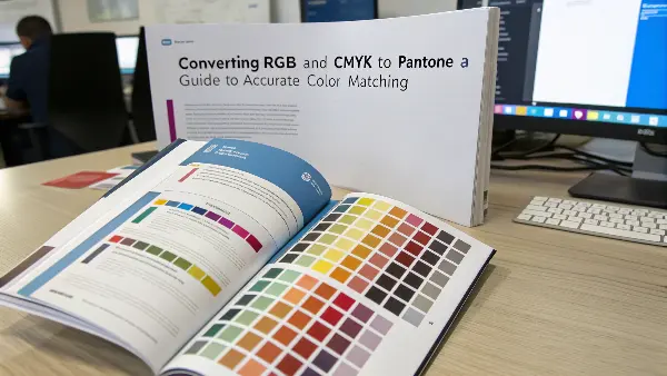
Getting color right feels like it should be simple, but it’s a common headache for many business owners I work with. They see one color on their computer and get something completely different from the factory. It’s a frustrating and expensive problem. But don’t worry, it is a problem we can solve. Let’s break down how these color systems work and how you can master them to get the results you expect.
What Are the Core Differences Between RGB, CMYK to Pantone?
Pick the wrong color mode for a project, and the results can be completely unexpected. A beautiful design on screen can become a muddy mess in print, and you’ll be on the phone explaining to your client why the colors are all wrong. That erodes trust and hurts the bottom line. Understanding the basic differences between RGB, CMYK, and Pantone empowers you to choose correctly from the outset, ensuring what you see on screen is what you get on your product.
RGB is the additive color model for digital screens. It creates color by adding light. CMYK (Cyan, Magenta, Yellow, Key/Black) is a subtractive model used in printing, where colors are created by absorbing light through ink on a surface. Pantone is the system of spot colors created using pre-mixed inks that guarantee the exact color match every time, which is crucial for branding. Use RGB when working digitally, CMYK for standard printing, and Pantone for precision color jobs.
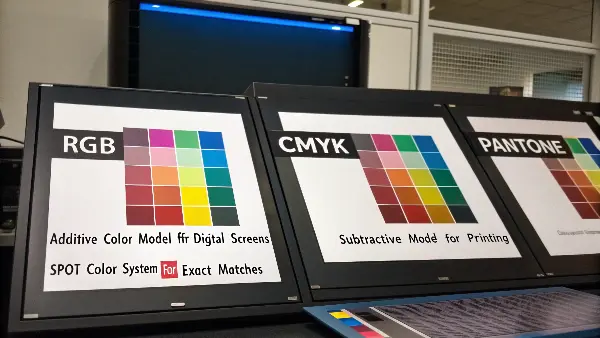
Let’s dive deeper into these three color systems. Think of them as different languages for color. If you try to speak the wrong one at the wrong time, you’ll get misunderstood. In my early days, I learned this the hard way when a client’s bright blue logo, designed in RGB for their website, ended up looking like a muted, dark blue on their packaging. The problem was a simple translation error between color languages.
Understanding the Language of Color
-
RGB (Red, Green, Blue): This is the language of light. Your computer monitor, phone, and TV create colors by mixing red, green, and blue light. When all three are at full intensity, they create pure white light. This is why RGB colors look so bright and vibrant on a screen. It’s an "additive" process because you are adding light to a black screen to create color.
-
CMYK (Cyan, Magenta, Yellow, Black): This is the language of ink. Printers don’t use light; they use ink on paper or other materials. They start with a white surface and subtract light. Cyan, Magenta, and Yellow inks are layered to absorb different light wavelengths. The "K" stands for Key, which is black ink, used for deep shadows and pure blacks. It’s a "subtractive" process. This is the standard for most printed materials like magazines and brochures.
-
Pantone (PMS): This is the language of precision. Instead of mixing four inks to create a color, Pantone uses a single, pre-mixed ink formula for each color. Think of it like buying a specific can of paint from the hardware store. Every can of "PANTONE 185 C" will be the exact same shade of red, no matter who prints it. This is why it’s the gold standard for branding where color consistency is non-negotiable.
Here is a simple table to help you remember the differences:
| Feature | RGB (Red, Green, Blue) | CMYK (Cyan, Magenta, Yellow, Key) | Pantone (PMS) |
|---|---|---|---|
| Best For | Digital screens, websites, apps | Printing, packaging, marketing materials | Branding, logos, consistent color matching |
| Color Model | Additive (mixing light) | Subtractive (absorbing light) | Spot Color (pre-mixed ink) |
| Color Range | Wide, vibrant gamut | Smaller gamut, less vibrant than RGB | Very specific, consistent colors |
Choosing the right mode from the start saves a lot of time and money. For any project heading to a physical product, you need to be thinking in CMYK or Pantone, not RGB.
How Do I Get the Exact Same Color From RGB to CMYKC to Pantone?
You have designed a stunning product image with brilliant colors on your screen. You send it for production, and the sample comes back disappointingly dull. The electric blue, that was so bright, turned into navy. These frustrating experiences are common, since screens (RGB) can display millions more colors than printers (CMYK) can actually reproduce. Converting from RGB to CMYK is a must, but doing it directly is also not without its hitches.
But the closest possible color match from RGB to CMYK can be viewed only with the use of the right color profile within your design software, in this case, Adobe Photoshop or Adobe Illustrator. Set your document’s color mode to CMYK from the beginning. Use the software’s "Proof Colors" feature to simulate how the RGB colors will look in CMYK. This preview helps you adjust colors manually to compensate for the shift before you ever send the file to the printer, preventing costly disappointments.
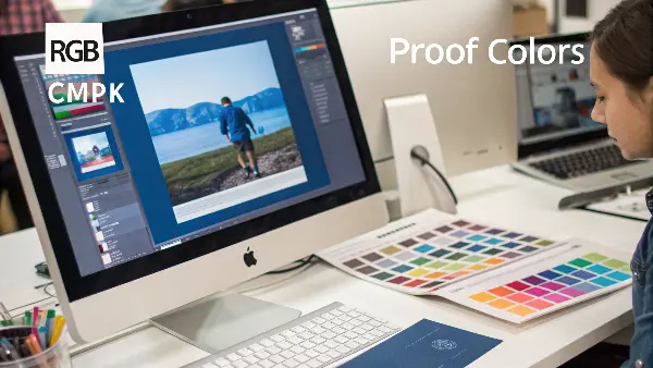
Let’s break down the practical steps to manage this conversion. The key is not to aim for an "exact" match, because that’s often impossible. Instead, the goal is to achieve a predictable and acceptable match. This is a common challenge for my clients who are developing products. They fall in love with a color on screen, and I have to help them find a realistic version that can be consistently produced on a physical object.
The Conversion Process Explained
The "gamut" refers to a device’s range of colors. The RGB gamut is much larger than the CMYK gamut, especially in the bright green, blue, and orange ranges. When you convert, your design software has to find the closest available color within the smaller CMYK gamut. This often means your brightest colors will become darker and less saturated.
Practical Steps for a Better Conversion:
- Start in CMYK Mode: If you know your project is destined for print or a physical product, start your design file in CMYK mode. This forces you to work within the limitations of print from the beginning. You won’t be surprised by color shifts later.
- Calibrate Your Monitor: What you see is not always what you get. An uncalibrated monitor can display colors inaccurately. Use a hardware calibration tool (like a Spyder or i1Display) to ensure your screen is showing you colors as accurately as possible. This is a pro move that makes a huge difference.
- Use Soft Proofing: In software like Adobe Photoshop, you can use a feature called "Soft Proof." This simulates on your screen what your design will look like when printed using a specific CMYK profile (e.g., U.S. Web Coated SWOP v2). It’s like a digital crystal ball. You’ll see the color shift happen on your screen, allowing you to make adjustments.
- Manually Adjust Out-of-Gamut Colors: When you soft proof, the software can highlight colors that are "out of gamut"—meaning they can’t be reproduced in CMYK. You can then manually adjust these specific colors, tweaking the CMYK values until you find a pleasing equivalent that is within the printable range. This gives you control over the final look.
By following these steps, you take control of the conversion process. You’re no longer just hoping for the best; you are actively managing the outcome to ensure the final product looks just as you intended.
Why Is the Conversion of CMYK to PMS Essential?
The most important parameter of professional printing and product design is the color consistency. The standard printing works well on CMYK (Cyan, Magenta, Yellow and Black) model, but in most cases the model fails to replicate some specific vivid or brand colors with precision. That is where PMS (Pantone Matching System) is used. CMYK to PMS conversion is a major benefit of this system in that colors can be reproduced with consistency regardless of the print method, media and location of manufacture providing the accuracy and consistency that brands and designers require.
Creating Cohesive Brand Equity.
Color makes each brand tell its identity and its emotional attraction. Nevertheless, due to CMYK printing, even slight color differences may occur due to the calibration of the printer, the quality of ink, or paper. When going to Pantone (PMS), the designers are assured of a consistent formula of ink, so that when a company makes its mark, like the red of Coca-Cola or the blue of IBM, it will always look exactly the same on packaging, in advertising, and in promotional materials. Such uniformity fortifies brand loyalty and confidence.
Getting around the Limited Color Range of CMYK.
CmyK color model has limited gamut i.e. it cannot produce all the colors that can be seen by human eye or can be seen digitally in R and G. Oranges, metallics, fluorescents and deep blues usually cannot be represented using CMYK. PMS comes with ready made inks that are made to produce these difficult to print colors with high vibrancy and saturation. Using CMYK values and converting them to PMS, designers have access to colors that just can not be produced using normal process printing.
Accuracy in Printing and Production.
CMYK printing is based on small dots of ink, which are overlapping, and these dots may lead to slight color or density change because of machine errors, or human mistakes. Inks used in PMS are however pre-mixed to the exact specifications at which point they are printed, thus, there is no possibility of inconsistency. This renders the use of PMS that is crucial in packing, corporate branding, and a project where accuracy and consistency cannot be compromised.
Less complicated interaction between designers and Printers.
In case of global teams and print vendors, conveying color expectations may become very difficult. A CMYK file may have differing results on two printers with different inks or papers. With Pantone conversion, designers and printers can also use the same universal color code so there are no misunderstandings or misinterpretations that may arise in the production process.
Better Quality Control and Proofing.
PMS colors make quality supervision easy as they can be easily compared standing next with the printed samples and the physical Pantone swatches. Should the output of a printer be different than the one that the official PMS indicates, the changes in question can be implemented within a short period. This does not only have the benefit of saving time and resources, but also assures that all batches of production are of professional quality.
Increased Graphical Effect and professionalism.
Colors in Pantone tend to be clean, more saturated and predictable, especially when used in solid parts of a print. Professional attention to detail and the quality of the overall visual appearance of printed materials are used when PMS is used in the design. PMS guarantees a more high-end and impactful final look whether it is luxury packaging or corporate collateral.
Color reproduction is a requirement which requires conversion of the CMYK to PMS in order to have good, consistent, and accurate color reproduction on all printed and manufactured materials. It assures brand integrity, beats the limitations of CMYK, enhances communication and simplifies quality control. To put it in a few words, PMS conversion is turning the color management into a game of guessing to a solid science – the basis of the professional and credible design implementation.
How Do I Match Pantone Color to CMYK?
You want your company’s logo, as specified in a certain Pantone color, to look the same across your website, business cards, and plastic products. But then your printer tells you that for the marketing brochures, they use CMYK. So, how do you ensure that that distinctive, rich red doesn’t turn into some flat generic red? This becomes a huge challenge because you are trying to reproduce a custom-mixed color using only four standard inks. A poor match can weaken your brand identity.
The most accurate way to match a Pantone color to CMYK is through the use of a Pantone Color Bridge guide. This physical swatch book shows a Pantone spot color printed directly next to its closest possible CMYK process equivalent. That means you have the benefit of seeing the potential color shift in your eyes before you go to print, and then determine whether or not the CMYK version will work for you or if you need to maintain the use of the Pantone ink due to brand consistency.

I always tell my clients that the Pantone Color Bridge is one of the best investments they can make if they care about color. It’s the dictionary that translates the "language" of Pantone into the "language" of CMYK. Relying solely on software conversions can be risky because screen variations can deceive you. The physical guide never lies. It shows you exactly what to expect from the printing press.
Why Direct Translation Fails
But think of a Pantone color as a specific, unique recipe for paint. CMYK is like taking four primary colors of paint and trying to mix them to match every color in the store. You can get close with a lot of them, but you just won’t get that exact same vibrancy, nor will you be able to achieve certain shades, such as neon or metallic colors. The CMYK gamut is simply too limited to replicate the whole Pantone library.
Your Best Tools for the Job:
- The Pantone Color Bridge: This is your number one tool. It has two versions: Coated (for glossy surfaces like shiny plastic or coated paper) and Uncoated (for matte surfaces). Always use the guide that matches your final product’s material. Look up your Pantone color in the guide. Right next to it, you’ll see the best CMYK approximation and its ink percentage values (e.g., C=0, M=100, Y=81, K=4).
- Software Settings: Your design software (like Adobe Illustrator) has built-in Pantone color libraries. When you select a Pantone color, you can ask the software to convert it to its CMYK equivalent. However, you should always cross-reference this with your physical Color Bridge guide. The guide is your source of truth.
- Communication with Your Manufacturer: This is critical. Talk to your printer or mold maker. Ask them what CMYK profile they use. Providing them with the Pantone color and the target CMYK values from your Color Bridge guide gives them a clear, actionable instruction. I’ve found that this simple conversation can prevent 90% of color problems down the line.
Here’s a small workflow I recommend:
- Step 1: Identify the official Pantone color for your brand.
- Step 2: Find that color in your Pantone Color Bridge guide (Coated or Uncoated).
- Step 3: Note the CMYK values printed next to the Pantone swatch.
- Step 4: Use these CMYK values in your design file for items that will be printed in CMYK.
- Step 5: Approve a printed proof from your vendor before a full production run.
This methodical approach removes guesswork and ensures your brand color remains as consistent as possible across different materials and printing methods.
In What Situations Would You Prefer Using Pantone Colors Over CMYK?
You are launching a new product line, and branding is everything. You need the color on your packaging and the product itself to be perfect. Should you use standard CMYK printing, which is often cheaper, or invest in Pantone colors? Make the wrong choice and you could have inconsistent branding that looks unprofessional, or you could overspend on specialty inks when that isn’t necessary. This decision directly impacts your brand’s perception and budget.
**Always prefer Pantone colors over CMYK when color consistency is crucial to your brand identity. Use Pantone for logos, key brand colors on packaging, and on the physical product itself. Since Pantone uses pre-mixed inks, it guarantees exactly the same shade of color every single time, anywhere in the world. CMYK is more fitting for full-color photographs and complex images where slight color variations are less noticeable, and cost is a primary concern.
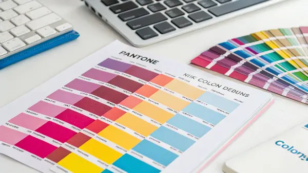
Deciding between Pantone and CMYK is a strategic choice. I work with business owners like Michael, who owns a U.S. manufacturing company. For his brand’s main logo, we always use a specific Pantone blue. It ensures that whether he’s printing business cards, molding a plastic part, or creating new packaging, that blue is always the exact same. It builds brand recognition and trust. But for a flyer with lots of photos, he uses CMYK because it’s more cost-effective and perfect color accuracy for every element isn’t needed.
Making the Right Call: Pantone vs. CMYK to Pantone
The choice boils down to a balance of brand integrity, consistency, and cost. Here’s a breakdown to help you decide.
When to Insist on Pantone (PMS):
- Logos and Brand Elements: Your logo is your company’s face. It must be consistent. If your logo is one, two, or three specific colors, using Pantone is the only way to guarantee it looks identical everywhere.
- Color-Critical Packaging: If your product is known for its signature "Tiffany Blue" or "Coca-Cola Red" box, that color must be perfect. Pantone ensures this level of precision.
- Manufacturing Plastic Parts: When we inject mold plastic parts, we use a masterbatch colorant. To ensure the color is right, we match it to a specific Pantone reference. Using a CMYK reference would be unreliable, as it’s a mix, not a solid standard.
- Projects with Limited Colors: For designs that use only a few colors (e.g., a 2-color t-shirt), Pantone printing can sometimes be more cost-effective than a full CMYK process.
When CMYK is the Better Choice:
- Full-Color Photographs: Photos are made of thousands of different color tones. CMYK printing is designed specifically for this and does an excellent job of reproducing photographic images.
- Designs with Many Colors and Gradients: If your design is a complex illustration with lots of colors, gradients, and shades, CMYK is the practical and economical choice. Trying to print this with dozens of Pantone inks would be incredibly expensive and complex.
- General Marketing Materials: For items like flyers, brochures, and internal reports where perfect color matching isn’t as critical as the message itself, CMYK offers a great balance of quality and cost.
- When Budget is the Top Priority: CMYK printing is almost always less expensive than using custom Pantone inks, especially for smaller print runs.
Ultimately, this is a business decision. Ask yourself: "Is this specific color essential to my brand’s identity?" If the answer is yes, invest in Pantone. If the answer is no, CMYK is likely the smart, practical option.
Conclusion
Mastering color conversion is less about magic and more about knowing the right tools for the job. RGB is for screens, CMYK is for standard printing, and Pantone is for brand precision. Utilizing physical guides like the Pantone Color Bridge, initiating designs in the correct color mode, and clear communication with the manufacturing partners means your colors can stay strong and consistent from that first digital concept into the final, physical product.
FAQs
Does this CMYK to Pantone conversion tool support various color profiles of CMYK?
CMYK to Pantone conversion tool is very reliable and will support various CMYK color profiles. It takes into account the color gamut and color features of various CMYK color profiles in order to provide the correct and predictable conversions to Pantone colors. Using the peculiarities of the specific CMYK color profile, the tool offers a more accurate and dependable output in the CMYK to Pantone color conversion.
What is the value of CMYK to Pantone conversion tool to you?
The CMYK to PMS conversion is useful because you get the following:
Matching Colors: This converts CMYK colours to Pantone which will assist in consistent matching of colours in various printing projects.
Brand Consistency: A conversion of CMYK colors into Pantone means that your brand colors are properly printed in print materials, whether it is a logo, packaging, or marketing collateral.
Design Flexibility: With Pantone conversion you more choices on colors and have increased design flexibility as well as a ability to control certain color choices.
How does the RGB, CMYK and Pantone colors differ?
RGB is a digital color system that involves the combination of light of red, green and blue to form colors on the screens. CMYK on the other hand combines cyan, magenta, yellow and black inks to be used in printed materials. It is a uniform system of pre-ready inks used by Pantone and has the unique codes that guarantee consistency of colors in industries, materials, and printing techniques.
What influences the Pantone color repeatability after conversion?
A number of variables such as paper finish, ink density, and press calibration affect the appearance of Pantone colors after printing. Color perception may condition even in light during an investigation. These variations can be minimized by regular maintenance of the equipment and standardization of lighting settings.
What is the reason I would change the RGB or CMYK color to Pantone?
Pantone conversion is useful in ensuring consistency in the visuals when the designs are transferred to print. It gets rid of the guess work as it involves a certain ink formula that means that the colors of the brands will be similar regardless of who is printing them. This is particularly crucial in businesses that have a rigid brand code or multinational manufacturing units.
What is the conversion of RGB or CMYK to Pantone colors?
You can work with design programs such as Adobe Illustrator, Photoshop or Pantone Connect and find the nearest shade of Pantone. It takes the analysis of your RGB or CMYK values and gives you a suggested Pantone color that looks like the same. The final result, where a high degree of precision is required, can be checked by professional spectrophotometers or Pantone color guides.
Why can colors in RGB or CMYK not always be able to match Pantone so well?
Varying systems of color have gamuts, or sets of colors that it can reproduce. Certain RGB hues are very bright or saturated and cannot be printed with CMYK or Pantone because of the physical constraints of ink. That is why designers usually make changes to colors slightly to obtain the maximal visual accuracy.
Does it have a software that ensures flawless Pantone matching?
There is no software that can guarantee a hundred percent perfection but sophisticated tools would end up giving near-precise results. Such tools as Pantone Connect, X-Rite Color Management, and Adobe Creative Cloud are characterized by exact conversion and visualization. Also to watch color scientifically, spectrophotometers are also employed to measure color in printers which are used in important applications.
