Tired of signing off on product color on screen, only to see the real thing look utterly different? And that’s when the redesigns start to get expensive, the delays irritating, and the wastage of materials starts piling up. Inconsistent color threatens your project’s budget and timeline, causing friction with your manufacturing partners. The Pantone Color System is the professional solution, providing a universal language to ensure the color you specify is the color you get.
The Pantone Color System refers to a universal standardized color matching system employed by designers and manufacturers to ensure color consistency. This system works by assigning a unique code to each specific shade of color, which is reflected in a physical guidebook. When you provide a Pantone code, your manufacturer uses their own licensed Pantone guide to mix the exact pigments necessary for that color in the final product. Subjective interpretation is taken out, and this ensures color accuracy across different materials, facilities, and production runs.
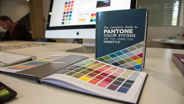
Now that you have a basic grasp of what Pantone is for, you might be wondering about the practical details. What do "Coated" and "Uncoated" mean? How is this system different from other standards like RAL? And why did Adobe’s recent changes make life harder for designers? Understanding these details is key to mastering color communication. Let’s dive deeper to give you the confidence you need to manage color perfectly in your next project.
What is the Pantone Color System and How Does It Work?
Think about the last time you tried to describe a specific shade, like "corporate blue," to a supplier, only to find their interpretation was completely different from yours. This kind of ambiguity is a common source of error in manufacturing, where parts don’t match and budgets get blown. The Pantone Matching System (PMS) was created to eliminate this problem by establishing one universal language for color.
**The Pantone Color System works by assigning a unique alphanumeric code to thousands of specific color swatches. A designer selects a color from a physical Pantone Formula Guide and communicates this code-for example, PANTONE 19-4052 Classic Blue-to the manufacturer, who then uses his own licensed guide and pigment formulas to reproduce that exact color. This simple but powerful system bridges the gap between a digital design and a physical product, eliminating any guesswork or misinterpretation of color.
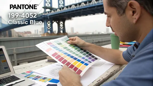
The genius of the Pantone system, first introduced by Lawrence Herbert in 1963, was its solution to the printing industry’s color consistency problems. Herbert realized that color was subjective, but a formula was not. The system he created is essentially a recipe book for color. The Pantone code is the name of the recipe, and Pantone provides the exact "ingredients" (a set of base pigments) and "instructions" (the mixing ratios) to create that color perfectly every time.
The Physical Guide is the Only Truth
In our digital world, it’s tempting to rely on screen colors. This is a mistake. Every screen is calibrated differently, showing slight variations in color. The physical Pantone Formula Guide is the ultimate source of truth. It’s a tangible, reliable reference that both the designer and the manufacturer can hold in their hands to ensure they are talking about the exact same color.
Communication Through Codes in Pantone Color Systems
The system’s power is in the codes. Instead of using a subjective term like "forest green," you’d use a very specific identifier such as "PANTONE 3435 C." All ambiguity is removed. When I get a technical drawing with a Pantone code, I know exactly what my client wants. And therein lies the start of a great manufacturing partnership, as seen in the typical workflow:
| Step | Designer’s Action | Manufacturer’s Action | Outcome |
|---|---|---|---|
| 1. Color Selection | Chooses ‘PANTONE 294 C’ from a physical Formula Guide. | – | Color decision is locked. |
| 2. Communication | Includes ‘PANTONE 294 C’ in all technical files. | Receives files with the exact color code. | Instructions are clear and unambiguous. |
| 3. Verification | – | Cross-references the code with their own physical guide. | Target color is confirmed. |
| 4. Production | – | Orders or creates a color masterbatch matched to PANTONE 294 C. | The final plastic part has consistent color. |
Initially developed for ink on paper, the Pantone system has expanded its reach into textiles, paints, and, most importantly for my customers, plastics. This ensures that a brand’s signature color can remain consistent across its packaging, marketing materials, and the product itself.
What Are the Different Pantone Libraries Really For?
You’ve selected a Pantone color, perhaps feeling rather confident in your selection. Then, your supplier asks a follow-up question: "Is that Coated or Uncoated? Is it from the Process or Solid guide?" This unexpected layer of detail can be confusing. Choose the wrong library, and your final result may not be what you expected, which costs time and money.
Most importantly, different Pantone libraries are special color guides designed for different materials and production methods. The most common is the Formula Guide for solid or ‘spot’ colors, available in ‘Coated’ – for glossy surfaces – and ‘Uncoated’ – for matte surfaces. Then there is the CMYK Guide, used in four-color process printing as found in magazines, along with others for plastics – PQ, textiles – TCX, and metallics. Choosing the correct library is key to ensuring that the color you specify can be correctly produced on the final product.
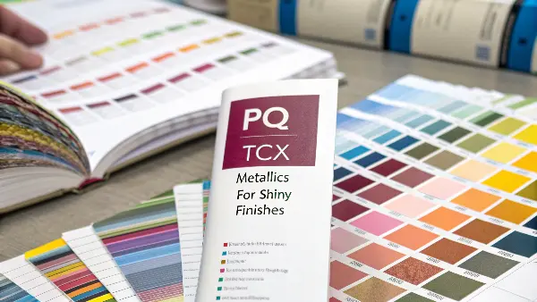
To use the system effectively, you have to understand which tool to use for which job. It’s like having different types of wrenches in your toolbox; you need to pick the right one.
Solid Colors (Pantone Matching System)
This is the core of the Pantone system, often called "spot colors." Think of these as custom, pre-mixed paints. Each color is created using a specific formula from a set of base inks. This method provides the highest level of accuracy and consistency, which is why it’s used for critical brand elements like the iconic Coca-Cola Red or Tiffany Blue. When you see a code with a ‘C’ for Coated (glossy paper) or ‘U’ for Uncoated (matte paper), you are dealing with a solid color. The same ink formula will look different on each paper type, so specifying this is critical.
Process Colors (CMYK)
Process colors are not pre-mixed. Instead, they’re created on the printing press by combining tiny dots of four standard inks – Cyan, Magenta, Yellow, and Key (Black). This is how your office printer produces photos and complex graphics. It’s cheaper for full-color images but less accurate for specific brand colors. Not every Solid Color can be perfectly matched in CMYK. The Color Bridge guide is an essential tool that shows a Solid Color next to its closest possible CMYK match, helping you manage expectations when converting between the two systems.
Specialty Guides for Manufacturing
Pantone extends beyond paper. For business owners like Michael, these guides are often more relevant:
- Pantone for Plastics (PQI): These are not paper books but collections of physical plastic chips. They show how a color will actually look in a specific polymer, like ABS or Polypropylene.
- Pantone for Textiles (TCX): This system uses dyed cotton swatches as the standard for apparel and fabrics.
| Library System | Best For | How it Works | Key Identifier |
|---|---|---|---|
| Formula Guide (Solid) | Logos, brand colors, precise matching. | Uses pre-mixed spot color inks. | Suffix of ‘C’ or ‘U’ |
| CMYK / Process | Full-color photos, magazines, budgets. | Colors are built from C, M, Y, K dots. | ‘PC’ or ‘UP’ |
| Color Bridge | Translating Solid colors to CMYK. | Shows Solid and CMYK versions side-by-side. | Shows both codes |
| Plastics (PQ) | Color matching for injection molded products. | Provides physical plastic chips for reference. | Prefix of ‘PQ’ |
| Textiles (TCX) | Fabric and apparel color specification. | Uses dyed cotton swatches as the standard. | Suffix of ‘TCX’ |
Understanding these distinctions ensures you are speaking the same language as your designer, printer, and parts manufacturer.
What’s the Difference Between the RAL and Pantone Color Systems?
You’re working on a project for a client in Europe, and their design calls for a color identified as "RAL 7016." Your trusty Pantone guide is now useless, and you have little idea how to match this color. Trying to guess or find a "close enough" Pantone shade is a huge risk that could get an entire production batch rejected.
The fundamental difference between Pantone and RAL is their origin and application. The Pantone system was developed in the United States for application in the field of graphic design and printing. The RAL system was developed in Germany for industrial applications such as paints, powder coatings, and plastics. While the Pantone system contains more than 2,000 colors with specified shades available for branding and aesthetic purposes, the RAL CLASSIC system has a far smaller palette consisting of 213 colors that are considered staples in industrial and architectural design. Both systems cannot be used interchangeably.
While both are color standardization systems, they were built for different worlds. Knowing which one to use is essential for anyone in manufacturing.
The World of RAL
RAL stands for Reichs-Ausschuß für Lieferbedingungen und Gütesicherung, which translates to the "Imperial Committee for Delivery Terms and Quality Assurance." Established in the 1920s, its purpose was to standardize colors for industrial and government use.
- RAL CLASSIC: This is the system you’ll encounter most often. It uses a simple four-digit code, where the first digit signifies the color family (e.g., 1 for yellow, 7 for grey). For example, RAL 7016 is Anthracite Grey, a very common color for window frames and machine enclosures.
- RAL DESIGN & EFFECT: For more specialized applications, RAL offers other systems. The RAL Design system is more comprehensive for architects and designers, while RAL Effect includes metallic and pearlescent finishes.
Application is the Deciding Factor
Think of it this way: If your project involves a logo, packaging, or a consumer-facing product for which branding will be important, then you’ll likely be using Pantone. If it involves industrial machinery, architectural elements, or powder-coated metal parts, you will likely be working with RAL. As a product owner, you may need to navigate both. For example, the plastic housing for your electronic device might be a Pantone color, while the metal stand it sits on could be a RAL color.
I once worked with a client trying to save time by asking us to match a Pantonespecified plastic handle to a machine enclosure that was powder-coated with a RAL color. They’d found a "close match" online. Of course, the small difference was readily apparent when seen under factory lighting. The handles had to be remade, at a cost of several thousand dollars and a lost week. There’s a clear lesson here: don’t ever try to convert between systems for a critical match. Use the standard specified for the job.
| Feature | Pantone Color System | RAL Color System |
|---|---|---|
| Primary Industry | Graphic Design, Printing, Consumer Products | Industrial Coatings, Architecture, Manufacturing |
| Geographic Focus | Global, with strong dominance in North America | European standard, widely used globally in industry |
| Number of Colors | 2,000+ in the core graphics system | ~213 in RAL CLASSIC; more in other systems |
| Naming System | Alphanumeric code (e.g., PANTONE 18-3838) | 4-digit numeric code (e.g., RAL 7016) |
| Interchangeable? | No. Conversion charts are only approximations. | No. Must use the specified system’s standard. |
What is the Science Behind the Pantone Matching System?
The Pantone Matching System (PMS) is a type of system that is a product of color science. In essence, the main idea of PMS is to standardize color reproduction based on various materials and processes. Here’s how it works.
The colors of Pantone are made up of an accurate combination of base colors. The colors are developed to match various materials and printing processes. As an illustration, the appearance of a Pantone color on a coated paper will be identical to the appearance of the same on an uncoated paper, despite the difference in their textures and finishes. It is done through modification of the ink formulas to include differences in absorption and reflection of the various materials.
An example would be Pantone 19-4052 Classic Blue; this would be a particular shade of blue that would appear the same when printed on a piece of paper and painted on a wall and also that shade of blue would appear the same when woven into cloth. Various libraries of various applications also form a part of PMS system e.g., solid colors, metallics, and pastels. Such libraries are regularly updated thus keeping up with the trends and with technology.
The pantone swatches are similar to the clock as such, 6 PM is not a time outside the clock, but it is a relative standard of reference that two individuals in different cities could use without any issue in understanding what it refers to. Likewise, a similar situation exists with Pantone swatches, which can be used as a source of reference when two individuals seek to correspond with color.
A major factor about the PMS is that unlike in the RGB and CMYK color production systems, this system is modeled on and takes into consideration the human eye perception of color. RGB and CMYK are techniques of ink or light pixel combination to create colors. Human eye is able to perceive more colors than the system such as RGB, CMYK or Pantone has. However, as Pantone provides proprietary color swatches and color formulas to match and reproduce colors on different surfaces that appear exactly the same to the human eye, it is usually favoured over other colour models. Additionally, Pantone swatches are also coded with RGB and HTML colors; they are also coded with special Pantone color codes, thus matching colors in a screen becomes a bit easier.
Why Were Pantone Color Books Removed From Adobe Software?
You opened Adobe Illustrator to work on a new design, and a warning notification said that the Pantone colors of your file might not display correctly. Now, your trusted color swatches have vanished or changed into black. This recent software modification has raised general confusion and worry, disrupting designers’ and manufacturers’ usual work that relies on these very tools daily.
**Adobe removed the included Pantone color libraries from its Creative Cloud applications-including but not limited to Illustrator, Photoshop, and InDesign-toward the end of 2022 due to a change in Pantone’s licensing model. Pantone created a standalone subscription service entitled Pantone Connect and started to require users to pay for this plug-in to have access to complete and updated color libraries. Adobe did not incorporate this new paid model, so that decades-long partnership came to an end. This will compel designers to either subscribe to Pantone Connect or to determine new workflows for color specification.
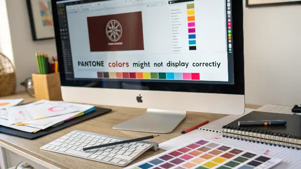
For years, the inclusion of Pantone libraries in Adobe software was a given. This change has fundamentally altered how creative professionals and their manufacturing partners handle color.
A Shift in Business Strategy
The crux of the matter is a business model change. Pantone decided it wanted a direct, paid relationship with every user of its digital color libraries. Their argument is that a subscription service like Pantone Connect ensures that every designer is using the most current, accurate color data, preventing errors from outdated libraries. Adobe did not pass this new cost and structure onto its customers, hence the removal of the libraries.
What This Means for Your Workflow
This isn’t just a minor inconvenience; it has real-world consequences for anyone producing physical goods.
- Legacy Files: If you open an old design file that contains Pantone colors, the software may not be able to identify them correctly. The swatches might appear as black or be automatically converted to a CMYK value, which is often not an exact match. This creates a significant risk of producing the wrong color if you’re not careful.
- New Designs: To create a new design using official Pantone colors within Adobe apps, you now need to subscribe to the Pantone Connect plugin. This is an added step and an extra cost that wasn’t there before.
- The Physical Guide is More Important Than Ever: As a manufacturer, this change has reinforced a rule I always follow: the screen is not the contract. The physical Pantone guide is our source of truth. My advice to all clients is now stronger than ever: "Regardless of what your software shows, the official Pantone code that you give us will be matched against our physical guide." This tangible book is our agreement on color, and it protects both of us from digital errors.
This change highlights the potential disconnect between digital tools and physical manufacturing. Always anchor your color-critical decisions to a physical standard, not just pixels on a screen.
Why Pantone Colors Matter in Design?
One of the most effective aids in the visual communication process is color, as it creates an atmosphere, establishes a brand, and stirs emotion. Nevertheless, it may be hard to create the same color effect when using various media and materials. That is when Pantone Colors enter into play. Pantone Matching System (PMS) enables the designers and producers to have a common language of color, which is accurate, consistent, and reliable in all the steps in the design and production process.
Uniformity between Media.
The designers frequently cross over into several mediums such as print, packaging, textiles, plastics, and the digital screen. The surfaces all have a different reaction with the color because of the differences in texture, gloss, and the composition of materials.
Pantone Colours are also guaranteed to match the same shade once printed on paper, stitched on cloth or even shaping it in plastic. As an example, Pantone 186 C, a bright red, will have the same recognizable look on a can of Coca-Cola as it will have on a poster or T-shirt.
Universal Color Communication.
Prior to Pantone, the signification of color was done mostly through subjective color descriptions such as the sky blue or the cherry red which was mostly confusing. Pantone fixes this by assigning each color a specific numerical value e.g. Pantone 485 C or Pantone 347 U.
This is a standard system enabling designers, printers and manufacturers worldwide to transmit color information accurately without any guesswork. Whether you are designing in New York or you are producing in Shenzhen everybody is referring to the same very color reference.
Brand Recognition and Identity.
The color has a crucial impact in brand recognition, e.g. the blue (Pantone 1837) of Tiffany & Co. or the green (Pantone 3425) of Starbucks. These colors are legally copyrighted and immediately identifiable in any part of the world.
Pantone allows brands to sustain the same visual consistency throughout all marketing platforms so that advertising, packaging, and signage are all the same brand-defining voice. Such consistency builds brand trust and awareness.
Quality Control and Accurate Color Proofing.
In manufacturing and printing (professional printing), minor colour variations may result in costly reprints or products of an incorrect brand. Pantone Colors ease the process of proofing and quality control through comparison of both physical and digital swatches.
Pantone has some calibrated tools that designers can use to preview colors and spectrophotometers that printers can use to ensure the final output is similar to the specified Pantone shade. This guarantees a reliable and quality finish on a regular basis.
Innovative Discovery and Investment Directions.
But Pantone is not only about precision but it is also a source of creativity. The Pantone Color Institute introduces the Color of the Year annually, which drives the trends of fashion, interiors and products around the globe.
These palettes are employed by designers in order to create emotionally appealing designs that appeal to the prevailing trends in culture and aesthetic. The system also incorporates large libraries of color- Metallics, Pastels, Neons, and SkinTones and thus creatives have unlimited opportunities to experiment with.
Digital to Physical Color Accuracy.
Colours on screens in the digital world nowadays will not be the same as those printed out because of the differences between RGB (light) and CMYK (ink) colour models. Pantone fills this gap by providing Pantone Digital Color System profiles that can be used to translate the color on a screen to what would be printed on paper.
This makes sure that the designers can see how colors will appear after printing saving time, cost, and frustration.
To summarize, Pantone is not merely a system of colors, but the framework of the visual consistency and creative accuracy in contemporary design.
How Do You Use Pantone Colors Correctly in Plastic Injection Molding?
You have carefully selected the ideal Pantone color for your new product. You provide the code to your injection molding partner, but when the first samples show up, you’re sorely disappointed in the color. It appears weaker, duller, or of a different tone altogether from the paper swatch you specified and approved. This can be frustrating, as this gap between your vision and the physical part is stalling your project and straining your budget.
**To use Pantone colors correctly in plastic injection molding, you will need to provide more than just a color code. You must specify the Pantone code and the exact plastic resin being used, such as ABS, PC, or PP, as well as the surface finish, which could be SPI-A1 high gloss or MT-11010 texture. That same color pigment can look quite different when the base color of the polymer, its transparency, and its texture differ. It is best to request a physical color plaque from your molder in your exact resin and finish for final sign-off before mass production.
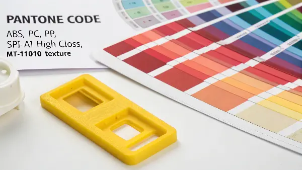
As a molder, I see this issue frequently. Getting color right in plastic is a science. A paper swatch is a great starting point, but it’s not the end of the story.
Key Factors That Influence Color in Plastics
Paper is opaque and has a consistent white base. Plastic is far more complex. Several factors can dramatically alter the final appearance of a color:
- Base Resin Color: Most plastics are not perfectly clear or pure white in their natural state. ABS can have a yellowish or milky tint, while Polycarbonate can have a blueish hue. This base color of the resin will subtly shift the final color of the part.
- Surface Finish and Texture: A high-gloss, smooth surface (like an SPI-A1 finish) reflects light and makes colors appear deeper and more saturated. A matte or textured surface (like an MT-11010) diffuses light, making the same color appear lighter and less saturated.
- Wall Thickness: Color can look different in thin versus thick sections of a part. A thin wall might appear more translucent or lighter, while a thick wall will look darker and more opaque.
- Color Masterbatch: The color isn’t a liquid paint; it’s a solid concentrate called a masterbatch that is mixed with the natural resin before molding. The quality of this masterbatch and its carrier resin must be compatible with the production resin to ensure an even, consistent color.
The Professional Workflow for Color Approval
To avoid costly mistakes, follow this professional process:
- Provide the Full Specification: Start with the Pantone code (e.g., PANTONE 294 C), but also provide the exact material (e.g., Covestro Bayblend FR3010 PC/ABS) and the surface finish code (e.g., VDI 3400 Ref 27).
- Reference a Plastic Standard (If Possible): If your company uses them, the Pantone for Plastics (PQI) chips are the ideal reference, as they are a plastic standard.
- Demand a Physical Color Plaque: This is the most critical step. Your molder should produce a sample part or plaque using your specified masterbatch, production resin, and finish. This plaque is the "golden sample." No full production run should ever begin until you have held this physical sample in your hands and signed off on it.
Don’t ever approve a final color based on a 3D render or a paper swatch alone. A physical sample made with the final material is the only way to guarantee what you see is what you’ll get.
Conclusion
Mastering the Pantone system is simply about making sure that communication is clear and unambiguous. Understanding the important differences in the key Solid, Process, and plastic-specific libraries will remove dangerous guesswork from your projects. Always be precise: state the color code exactly, state the material, and state the surface finish. Most importantly, always approve a physical sample before going to full production. This simple discipline will make certain that your intended color becomes a reality, saving time, money, and headaches on every single project.
